Making Friendly CSS With Tailwind CSS
AMAECHI AMARACHI
19 Dec 2022
•
10 min read

Writing CSS can aggravate developers, but with tailwind, CSS becomes more friendly to use. In this article, I will be taking you on a journey into the utility first framework, “Tailwind.”
What is Tailwind CSS?
According to the official documentation, Tailwind CSS is a utility-first CSS framework for rapidly building custom user interfaces. Tailwind enables you to write inline styling and achieve a fantastic user interface without leaving your HTML code and writing a single line of CSS.
In contrast to other CSS frameworks like Bootstrap or Materialize CSS, Tailwind CSS doesn’t come with predefined or built-in components. Instead, Tailwind CSS provides you with a set of CSS helper classes that enables you to create a custom design with ease.
In my opinion, most sites built with Bootstrap always look alike and have the same feel. But Tailwind CSS is not opinionated, and it allows you to create your unique design.
Setting up a project with Tailwind CSS.
Learn how to get Tailwind CSS up and run your project.
Using Tailwind via CDN
Using tailwind via CDN is excellent if you want to set up a simple project or quick demo quickly. But note that many great tailwind features are not available via CDN.
Here is the latest default configuration via CDN:
<link href="https://unpkg.com/tailwindcss@^2/dist/tailwind.min.css" rel="stylesheet">
HTML starter template
This is what your HTML5 doctype looks like when you include tailwind CDN.
<!doctype html>
<html>
<head>
 <meta charset="UTF-8" />
 <meta name="viewport" content="width=device-width, initial-scale=1.0" />
 <link href="https://unpkg.com/tailwindcss@^2/dist/tailwind.min.css" rel="stylesheet">

</head>
<body>
  <h1>Welcome to Tailwind CDN</h1>
</body>
</html>
Install Tailwind via npm
Installing tailwind via npm or yarn gives you access to tailwind awesome features, unlike using tailwind via CDN.
Before you install tailwind via npm, create a new package.json file by using the npm command.
npm init -y
then Install tailwind via npm
npm install tailwindcss
Include Tailwind in your CSS
The next step is to include Tailwind in your CSS. You can do that by creating a new CSS folder. If you don’t have one, then you create a CSS file. You can name it whatever you like, but I would be naming it style.css for the sake of the project.
Add the following to the style.css file.
 /* ./css/style.css */
@tailwind base;
@tailwind components;
@tailwind utilities;
Add postcss plugins
npm install postcss-cli autoprefixer
Create your configuration file
To complete the tailwind setup, we will create a configuration file that enables you to customize your tailwind project.
use this command to create a configuration file
npx tailwindcss init
This will create a tailwind.config.js file at the root of your project.
// tailwind.config.js
module.exports = {
  purge: [],
  darkMode: false, // or 'media' or 'class'
  theme: {
    extend: {},
  },
  variants: {},
  plugins: [],
}
Processing CSS with Tailwind
You can add tailwind and autoprefixer to your PostCSS configuration by creating a postcss.config.js file at the root of your project.
add this to your postcss.config.js file
  //postcss.config.js
  module.exports = {
     plugins: [
        require('tailwindcss'),
        require('autoprefixer'),
       ]
    }
In package.json, insert the following build script:
"build": "postcss css/style.css -o build/style.css"
To execute this script, type in:
npm run build`
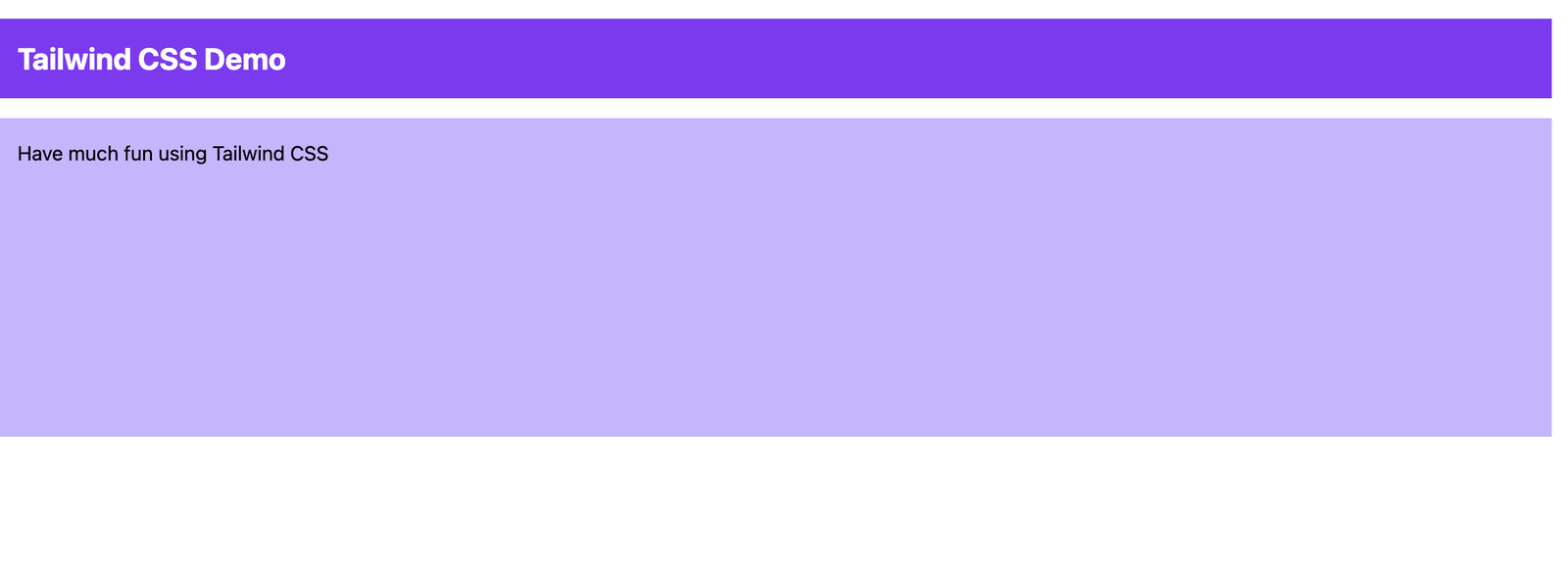
Create an index.html File
Let’s create a new file index.html in the build folder and insert the following HTML code.
    <!DOCTYPE html>
    <html lang="en">
    <head>
        <meta charset="UTF-8">
        <meta name="viewport" content="width=device-width, initial-scale=1.0">
        <link rel="stylesheet" href="style.css">
        <title>Tailwind CSS Demo</title>
    </head>
    <body>
        <div class="h-64">
            <div class="p-4 m-4 bg-purple-600">
                <h1 class="text-2xl font-bold text-white">Tailwind CSS Demo</h1>
            </div>
            <div class="p-4 m-4 bg-purple-300 h-full">
                <h2 class="text-purple-900">Have much fun using Tailwind CSS</h2>
            </div>
        </div>
    </body>
    </html>
Set Up live server
To set up a web server for our server, we are going to use a live server. To use a live server, install it via npm:
npm install -g live-server
Next, you start up the live server by typing this command.
live-server build
You should then be able to open the website by pointing the browser to URL 127.0.0.1:8080.
The result can be seen below:
Components With Tailwind CSS
Unlike other CSS frameworks like bootstrap, materialize CSS, etc., tailwind doesn’t come with predefined built-in components for different components like buttons, cards, navbar, etc. In this section, you will learn how to style your components with Tailwind CSS utility classes. we are also going to see how we can make friendly CSS with tailwind by building components and compare how it is written in tailwind and Vanilla CSS
Component 1: Button
Let’s style a button.
Here, you are going to create a Submit button and also style it
 //tailwind.css
 <button class="bg-blue-700 w-60 text-white border-2 border-blue-700 rounded py-3
    hover:bg-red-500 hover:border-transparent">
       Submit
 </button>
The following utility classes are applied:
bg-blue-700: This class sets a blue background to the button. The value 700 is just a shade number that ranges from (50-900) .
w-60 : This class represents the width of the button. The value 60 is equivalent to 15rem, which is also 240px when converted.
text-white: This class set the text to white. It is equivalent to color:white in vanilla CSS
border-2: This class set the border width to 2px
border-blue-700: This class sets the border-color to blue. The value 700 is just a shade number, as earlier stated.
rounded: This class sets the border-radius to 0.25rem, which is also 4px when converted.
py-3: This class sets the padding-top and padding-bottom to 0.75rem which is also 12px each when converted.
hover:bg-red-500: This class turns the blue background red when it is hovered on.
hover:border-transparent: This class makes the borders to be transparent when hovered on.
The result should look like this in tailwind CSS:

The result should look like this on hover:

Styling With Vanilla CSS
    //index.html
    <button class="button ">Submit</button>
    //style.css

    .button{
      background-color: blue;
      width: 240px;
      color: white;
      border: 2px solid blue;
      border-radius:4px;
      padding-top: 12px;
      padding-bottom: 12px;
    }

    .button:hover{
       background-color: red;
      border: transparent
    }
The result should then look like this in vanilla CSS

The result should look like this on hover

You can see how you created a button and styled it within tailwind CSS. you could also see how you wrote lesser code, and also it made inline styling more cleaner and readable Compare to regular CSS. We could see all the styling we had to do. Even if you try to style regular CSS inline, it will become cumbersome, and it won't be easy to read.
Component 2 : A Card
Finally, let’s take a look at how to style a card component with Tailwind’s utility classes:
    //index.html
    <!DOCTYPE html>
    <html lang="en">
    <head>
        <meta charset="UTF-8">
        <meta name="viewport" content="width=device-width, initial-scale=1.0">
        <link rel="stylesheet" href="style.css">
        <title>Tailwind CSS Demo</title>
    </head>
    <body class="bg-gray-300">
        <div class="bg-white mx-auto my-40 shadow-2xl  w-3/5 h-96 rounded flex ">
            <img src="https://i.pravatar.cc/200" alt="random avatar">
            <div>
                <h1 class="font-bold text-2xl p-5 mt-20">Hello! My Name is kaylie</h1>
                <p class=" text-xl p-5 mt-2">I am a lover of good things</p>
            </div>
        </div>
    </body>
    </html>
The following utility classes are applied:
bg-gray-300: This class is set to the body to change the default white background to gray.
mx-auto: This class is set to move the div to the center. mx represents margin-right and margin-left
my-40: This class is set to move the div from top and bottom 10rem each.
shadow-2xl: This class represents the box shadow of the card.
w-3/5: This class sets the width of the card to 60%
rounded: This class sets the border-radius to 0.25rem which is also 4px
h-96: This class sets the height of the card to 384px
font-bold: This class sets the font-weight to bold
text-2xl: This class sets the font-size to 24px
p-5: This class sets the padding to 20px
mt-20: This class sets the margin-top to 80px
text-xl: This class sets the font-size to 20px
mt-2: This class sets the margin-top to 8px
The result should then look like this in tailwind CSS
Vanilla CSS
    //index.html
    <!DOCTYPE html>
    <html lang="en">
    <head>
        <meta charset="UTF-8">
        <meta name="viewport" content="width=device-width, initial-scale=1.0">
        <link rel="stylesheet" href="style.css">
        <title>Tailwind CSS Demo</title>
    </head>
    <body>
      <div class="card">
        <img src="https://i.pravatar.cc/200" alt="random avatar">

        <div>
            <h1 class="card-h1">Hello! My Name is kaylie</h1>
            <p class="card-p">I am a lover of good things</p>
           </div>
      </div>
    </body>
    </html>
Styling With Vanilla CSS
    //style.css
    body{
      background: lightgray
    }
    .card{
      background-color: white;
      margin:40px auto;
      box-shadow: 0 25px 50px -12px rgba(0, 0, 0, 0.25);
      width: 60%;
      height: 384px;
      border-radius: 4px;
      display:flex;
    }
    .card-h1{
      font-weight:bold;
      font-size: 24px;
      padding: 20px;
      margin-top: 80px;
    }
    .card-p{
      font-size:20px;
      padding: 20px;
      margin-top: 8px;
    }
The result should look like this in Vanilla CSS
You can see that you achieved the same result in the example above, though with a different method. This component example shows you the basics of how tailwind works in relation to Vanilla CSS. Now let me go further to explain why you should use Tailwind CSS in your next project.
Why Use Tailwind CSS### Responsiveness to the core
Gone are the days where you needed to write lots of media queries to build a responsive application. With Tailwind CSS, you can create a responsive design with ease in the class attribute. Tailwind CSS also uses a mobile-first approach in creating responsive applications.
There are five breakpoints by default, inspired by common device resolutions:
| Breakpoint prefix | Minimum width | CSS |
|---|---|---|
sm |
640px | @media (min-width: 640px) { ... } |
md |
768px | @media (min-width: 768px) { ... } |
lg |
1024px | @media (min-width: 1024px) { ... } |
xl |
1280px | @media (min-width: 1280px) { ... } |
2xl |
1536px | @media (min-width: 1536px) { ... } |
Let’s look at an example below.
    <!DOCTYPE html>
    <html lang="en">
    <head>
        <meta charset="UTF-8">
        <meta name="viewport" content="width=device-width, initial-scale=1.0">
        <link rel="stylesheet" href="style.css">
        <title>Tailwind CSS Demo</title>
    </head>
    <body>
        <div class="lg:text-9xl md:text-5xl lg:font-extrabold md:font-bold text-center
            mt-40">Hello World</div>
    </body>
    </html>
The code above changes the text size based on the screen size. To see the responsiveness in action, check out this codepen demo and try to adjust the screen size to see the responsiveness.
Inline Pseudo-Classes
One thing vanilla CSS inline styling can’t do is handling pseudo-classes such as hover, focus, and active states. But with Tailwind CSS, you can apply pseudo-classes to an element in the class attribute itself.
For example
<div class="bg-red-900 hover:bg-blue-900 mt-10 text-center">
<span class="text-5xl text-white hover:text-yellow-300 ">Hello world!</span>
</div>
```
##### The result
##### On hover

We could see the `background-color` at `red` and `text-color` at `white` from the example above. On hover, the `background-color` will change to `blue` while the `text-color` changes to `yellow`.
### Customization
Tailwind CSS has many advantages over other frameworks, and one of them is the customization options. Tailwind allows you to configure your utilities within a single `tailwind.config.js` file.
The customization file enables you to easily customize utilities such as colors, spacing, themes, etc. You can read more about customization [here](https://tailwindcss.com/docs/configuration).
For example, let’s override the tailwind default blue color already present in the default theme, so our custom values will override the default value.
Here we will use the same numbered notation for the color shades to override the default blue color.
#### The `tailwind.config.js` file should now look like this:
```
module.exports = {
purge: [],
theme: {
extend: {
colors: {
blue: {
'100': # 72c1df',
'200': # 5bb7d9',
'300': # 43add4',
'400': # 2ca2ce',
'500': # 1498c9',
'600': # 1289b5',
'700': # 107aa1',
'800': # 0e6a8d',
'900': # 0c5b79'
},
},
},
},
variants: {},
plugins: [],
}
```
### Tighten up long class lists with @apply
Tailwind CSS inline styling can become messy when the styling gets long. That is when @apply comes in. The @apply directives can also use to curb the repetition of classes that may occur in styling. For example, if you were to give 2 HTML elements similar styling, the @apply can help you avoid repetition.
```
//index.html
<div class="btn">
</div>
```
```
//style.css
.btn {
@apply my-2 px-4 py-2 border-2 border-blue-500 rounded-md bg-gradient-to-b
from-blue-600 to-blue-400 hover:from-blue-500 hover:to-blue-300 text-white shadow-l
}
```
### Ease Of Use
Tailwind CSS is extremely easy to use. At first, learning all the naming schemes might take a long time to grasp. But once you grasp it, you will know exactly how to configure the entire library to your satisfaction. The naming scheme is also one of the most important parts of tailwind. For example, `p-{n}` for padding, the `-{n}` for using a certain value for the utility. `md:`for handling breakpoints, etc.
### No More Naming Problems
One thing I don’t fancy about vanilla CSS is the fact that I have to come up with unique class names for styling purposes. But with Tailwind CSS, you can do your styling right inside the HTML tag, and each inline styling is scoped to that specific tag.
## Conclusion
Before picking up tailwind CSS, you have to be good with your vanilla CSS because you might end up using classes without knowing how they work.
If you are good with Vanilla CSS and want a faster styling process, and you are also willing to invest time in learning utility classes, then tailwind CSS is an excellent choice.
Tailwind CSS introduces a different approach of how other CSS framework works. It provides you with a set of utility classes that can be used to create a unique design with ease.
Tailwind CSS is also not opinionated, so you are free to design your application the way you want.
In this article, you have learned how to set up Tailwind CSS in your project. You have also seen how utility classes can be used in building components like buttons and cards. I also went further to give you practical reasons why you should use Tailwind CSS. To learn more about Tailwind CSS.
The [official documentation](https://tailwindcss.com/docs) has several additional resources, including examples, screencasts, and tutorials.
Thanks for reading. I hope that I helped you learn something new today!
AMAECHI AMARACHI
👩🏽💻Front-End Engineer ✍🏽Technical Writer 🚀 Co-organiser @vuejsng
See other articles by AMAECHI

WorksHub
Jobs
Locations
Articles
Ground Floor, Verse Building, 18 Brunswick Place, London, N1 6DZ
108 E 16th Street, New York, NY 10003
Subscribe to our newsletter
Join over 111,000 others and get access to exclusive content, job opportunities and more!